Currently, I am taking a portrait painting course with Joe Trigiani at the Loudoun Academy. He recommends a much more extensive palette than I usually use. His supply list can be found at: http://www.loudounacademy.org/supplylisttrigianipaint.html.
Joe uses mostly Gamblin colors as part of his extended portrait palette, including Soft Mixing White (Winsor Newton), Hansa Yellow Deep, Naples Yellow Hue, Yellow Ochre, Napthol Scarlet, Quinaridone Red, Alizarin Crimson, Indian Red (Winsor Newton), Burnt Sienna, Raw Sienna (Winsor Newton), Raw Umber, Transparent Earth Orange, Permanent Green Light, Phthalo Green, Dioxazine Purple, Cerulean Blue, Cobalt Blue, Phthalo Blue, Ultramarine Blue, Ivory Black.
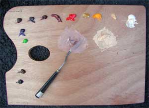 Not all of these colors are laid out on the palette. For the first lesson, using a brunette, he laid out only the following paints on his palette:
Soft mixing white, naples yellow, cadmium yellow, yellow ochre, napthol crimson, Indian Red, Alizarin Crimson, dioxizine purple, burnt sienna, ultramarine blue and Van Dyke Brown. He later recommended Permanent Green light for use in the shadow tones. Joe uses them to blend into two "base colors" that he mixes up before starting to paint the model, and which he varies based on the color of the model's skin.
These are basically:
(1). a light skin tone, made from white, cad yellow, yellow ochre, and napthol crimson. (You can use Cadmium Red medium instead of Napthol Crimson.)
(2). A shadow flesh, made from the light skin tone above but adding more Nathol Crimson, More Indian Red, dioxizine purple, and ultramarine blue.
 We used a sight-size method of painting, where the easel is placed on the same plane as the model, but each stroke is mixed from about 9 feet back and laid on the canvas by walking forward, and then returning back to mix the next stroke. The picture here shows the model stand and one of the students' easels. Notice that the model stand is not ideal. Ideally, the stand would be high enough to place the model's head right next to the canvas when viewed from a distance. Here, the stand is too high.
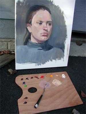 The student artists are then instructed to stand back (about 9 feet, I believe) and locate one discrete area of color and mix that exact color, move forward, and place that color shape on the canvas. The form is built slowly by repeating these steps, never mixing color or applying more than one stroke at a time while standing directly at the canvas. Given this restriction, I was surprised but pleased to see the form of the head actually appear. Please note that I always paint standing or sitting right at the canvas and this was a radical change for me. The thumbnail picture shown here wastaken after the second 2 and a half hour session. We worked on this model for three sessions, and I think, for a finished portrait, we could well have worked for 6 sessions. The third session, she came without the turtleneck because her floors were being finished and she was unable to get into her house. The v-neck she wore actually gave a more interesting composition, and I'll post it when I have taken a photo.
A slightly different version of this post is posted on my website as Lesson 38. It has larger pictures if you'd like to check it out.

No comments:
Post a Comment