"ART is a word which summarizes THE QUALITY OF COMMUNICATION. "
L. Ron Hubbard

Tuesday, February 08, 2011

Two new studies

Two new studies I'm excited about.

                          The "Fruit Bowl and Tiles" is an interpretation I did from a reference photo I took for a previous still life done in the Fall. The original was done in oil and was done from the actual still life.It adheres more strictly to "real life". In this one, I decided to play with color and form. I particularly like the way different colors that are the same value or tone can be overlaid, as in the purple shadow over the blue shadow, lower right.
The second one is a loose interpretation of a landscape. I particularly liked, in the original photo, the bright trees reflected in the water. They are the stars of the show.

Thursday, January 13, 2011

Still Life

Sometimes a "demo" painting turns out unexpectedly good.

 
Demo of still life using acrylics done Jan 8, 2011

I did this painting of a still life for a small group gathered at the Great Falls School of Art on January 8, 2011. since it was to be a demo and rather quickly done (to give participants time to paint) I used a piece of unstretched canvas taped to a drawing board. Now, since it turned out so well, I wish that I had used a stretched canvas. Ah well!

Friday, December 31, 2010

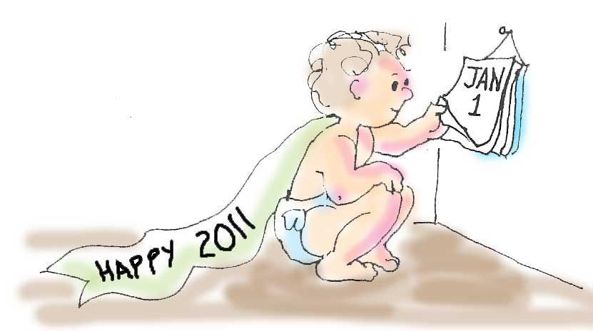
Best wishes for joyful and prosperous 2011

Drawing by Pam, Poem by Dean
    
Why We're Here

We were designed by the wind, frustrated
with its inability to inflate a balloon.

We were invented by dogs because after aeons
of licking only each other, they yearned for love
without hairballs.

We evolved from birds, who wanted to be able
to talk with their hands without being carried away.

We were invented by cats to tend door knobs.

We were invented by stones who wanted to reproduce
themselves, but could not set one stone
upon another.

We were invented by the night, grown tired
of having nothing to hide.

We were invented by the flowers, sick and tired
of color-blind bees who only wanted them
for one thing.

We were thought up by the fish, trying to imagine
dreaming with their eyes closed.

We were invented by the snow, dreaming of hugging angels.

We were invented by the fire to reflect it in eyes and cheeks,
for every other creature, fearing it, could not admire it.

We were invented by the sand to make fine distinctions.

We were created by the sun when he discovered
that, alone, he could light up only one side
of the earth at a time.

We were created by the rain, which could not
spell its name in the sand.

The earth made us in hopes we would enable it
to see where it's going.

We were made by the ocean to package its
salty elixir and distribute it to high ground
beyond the reach of surf.

We were made by mountains grown tired of crushing
everything they tried to embrace.

We were made by the full moon because,
though it could reflect endlessly,
it could not smile.

We were made by the trees, because they couldn't
hear themselves fall.

We were made by the grass to graze with our eyes
and gobble up the excess green.

We were made by the cockroaches because their faith
forbids suicide.

            by Dean Blehert

Wednesday, December 29, 2010

Shack in the Woods

Shack in the Woods
This painting, Shack in the Woods, is mixed media. I laid down a thin multi-colored ground over the white gesso using acrylic and a sponge. The idea was to capture the busy-ness of the woods. Then I overworked with oil for the details. I'm particularly fond of the rock cliff behind and to the right of the shack.

Saturday, December 25, 2010

Teaching Visual Arts

I'd like to tell you a little about my philosophy in "teaching" art, since the role of the teacher in a creative process is important.

Contemporary philosopher L. Ron Hubbard has said "Art is a word which summarizes the quality of communication." That's a very brief and deceptively simple statement.

I believe that we are all artists, and how GOOD we are depends on our application to the craft of our particular art (whether it is painting, or writing, or music, or dancing, or cooking, or whatever) as well as to that mystical thing we call "talent."

The teacher of art, I believe, is someone who knows the basics of that craft well enough to teach it and who, in addition, can recognize and validate the current and potential quality of his or her student's products.

In teaching, I am not trying to teach you to "paint like me" or to paint like some concept of "the right way to paint." I am trying to provide tools and direction which will help you improve what you want to communicate.

This is a world which focuses on Quantity. Quantity is important in that it takes practice with your basics and materials in order to improve the product. But when we focus on QUALITY, we are looking at how well the product communicates.

The extraordinary thing about a work of art, to me, is that every work of art is a new creation. I look around my classes and am delighted and amazed at what my students, at ANY stage of competence, can create.

If you are in the Reston-Herndon-Great Falls area and would like to take art classes, you can find out more about upcoming classes on my website, www.blehert.com.

Monday, December 20, 2010

The perfect "cool" yellow

For some time now, those of you who've studied with me will be aware, I've been advocating a palette (both in acrylic and in oil) based around the use of warm and cool variants of the basic red-yellow-blue triad. This was based on my interpretation of the book Blue and Yellow Don't Make Green by Michael Wilcox. But the cool yellow was always a problem. The closest I could seem to get in the store was lemon yellow or pale yellow.

But I have discovered Titanate Yellow, a very cool (almost greenish) yellow, and I know that it is available at Jerrysartarama.com from Golden (for acrylics) or Grumbacher (for oil paints.)

Colors are not particularly true on the web and can vary from website to website, but here are a few samples of the Titanate (or Nickle titanate) color.
Sample of Golden Acrylic's Titanate Yellow


And of Grumbacher's Nickle Titanate Yellow in Oil:


I consider this color a strong addition to your palette because it permits you to make a brillient green when paired with Phthalo Blue.

Thursday, November 25, 2010

Five Winter Paintings

Winter 4
I've completed five tiny (8" x 10") winter scenes for a local realtor, who gives them to clients as good will gifts at the holiday season. Your can see all five on my website and also the ones I produced last year. These would also make good xmas cards and, as artist, I hold the rights to reproduce them as prints or cards despite their sale. Contact me if you are interested.

Tuesday, November 16, 2010

Some New Paintings by Pam Coulter

The following paintings are newly completed except for signing and edge painting. I thought you'd like to see them. Each of these paintings was done as a "demo" over several sessions. The first was done for my class in oil and acrylic painting at the Reston Community Center (Fall, 2010). It was done from a reference photo of the sun rising (or setting?) seen through the mist. It has a peaceful mood to it.
Mist on the River, 16 x 20, acrylic on canvas
The next painting, Still Life with Apples, was set up in my studio for a studio lesson with only 1 student. I wanted to keep it simple, and that simplicity is endearing, I think, with dominant browns and reds against a pale neutral backdrop.

Still Life with apples, Jug, 14 x 18, oil on canvas
For the second still life in the studio, I got a little more daring, with blues and greens dominant, offset by the brilliant orange. I am particularly pleased with the result. The book shown in the painting is a small book featuring the German Expressionist school of art.

Still Life with Oranges, 16 x 20, oil on canvas

The discovery of Prussian Blue

Browsing the web, I discovered a fascinating piece on the discovery of Prussian Blue on About.com/painting. You can read the article here.
I should say that Prussian Blue (and its more modern counterpart, "Thalo" or Pthalocyanine Blue) are very strong, staining pigments, not to be used in large quantities. They will overwhelm any color with which they are mixed, and they will overwhelm any painting if used in any quantity.
That said, Prussian or Thalo Blue is a warm blue which, mixed with lemon or zinc yellow, makes a bright, jewel-like green. I include it on my recommended limited palette because of that, but it should be used sparingly and with caution.

Monday, November 08, 2010

Current shows

Two of my paintings (one large and one small) were accepted in the Art League of Alexandria November show at the Torpedo Factory in Alexandria, VA.

"Uhaul" is 30" x 40" and painted in Acrylic. As reference, I used a photo I took in Florida of a Uhaul truck drawn up to a warehouse. The contrast between the very bright and controlled shapes on the truck and the truck itself and the shades of gray in the rest of the scene interested me.

Uhaul by Pam Coulter
"Rainforest, St. Kitts" is a very small ink and watercolor sketch done while on a cruise to the Caribbean. It is matted and framed to 8" x 10". I use watercolor for casual sketching and visual notes because it helps me "translate" what I see from the sometimes rather confusing "reality" of the photographic world to a more poetic one.

Rainforest St. Kitts by Coulter
They will be on display through December 6 at the Art League Gallery.