"ART is a word which summarizes THE QUALITY OF COMMUNICATION. "
L. Ron Hubbard

Wednesday, December 28, 2005

Pricing your art

The following was written as an answer to a fellow artist looking for advice and is posted here for discussion.

Pricing is very personal. Base it on concepts like exchange, what the market will bear, and what you're willing to part with your art for. Take into consideration how long it takes you to paint a painting and what you want or need per hour for your work. Establish your "wholesale price" as the least you want to part with a painting for. The “retail price” should be at least double that depending on what gallery you're in. Some US galleries take 60% and it’s well worth it for a gallery that really sells. My experience is that it's easier to sell your work through a gallery because people assume that the gallery personnel have made important decisions about product viability. People don't usually trust their own intuition. Also, you need to take into account how fast you want to sell. Price lower if you're prolific and you want turnover.

There's another consideration. How long a time do you expect to be in the business of art? I’m 62 now, I've begun thinking about what will happen to my paintings when I die. I mean, I intend to live to at least 85, but who knows. At some point, I will make a list of relatives, buyers, students, and friends and invite them to "have" a painting just to give the paintings a home. (Somewhat like having a cat.) (Those of you reading this who are my friends and students better make sure you let me know when you move!)

In short, pricing art is a personal thing. I would suggest that you browse local galleries and outdoor shows and see if you can get an idea of what the "market price " is. What are people asking? Are they selling?

Small painting by Coulter recently sold on eBay
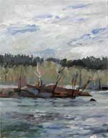
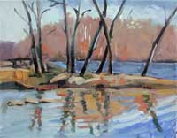
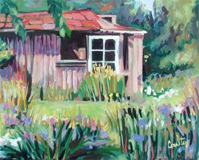
I sell as high as $3400 for large commissioned work. On the other hand, I've recently begun selling small early pieces (16 x 20 and less) on eBay for much less. I decided to try it just to see if there was some kind of market. There was. But browsing through the eBay art market was very discouraging at first because there's so MUCH out there for sale and so little of it sells. I was surprised to find that I have a certain kind of art (sort of impressionist landscape) that apparently fits the market. It is possible that the people who buy go look at my website and bio and decide to buy based on my background and awards. I've sold 6 pieces now and I consider it a viable outlet for older smaller pieces. If you want to see what I offer at any time, just do a search on ebay.com for COULTER. (That’s my signature name.)

Tuesday, December 27, 2005

The beauty spot

Saturday, December 24, we had incredibly mild weather, and I called my outdoor painting buddy and we went out to paint at what he calls "The Beauty Spot" along the Potomac River above Great Falls. This is referred to as "Plein Air Painting". It was popularized during the time of the French Impressionists, and you may have thought (if you knew anything about it) that they simply came up with this brilliant idea to paint their pictures "on the spot." In fact, however, the ability to paint on location was facilitated by a technological advance: the production of colors in tubes. Before that time, dry colors had to be ground into the paint in the studio prior to painting. It was the production of tube colors and the availability of a wider range of colors than previously that allowed the radical change in how the painter could paint. (Oh, and by the way, the impressionists didn't — as popularly supposed — complete all their paintings on location. Investigation has uncovered that some of them worked on their paintings long after the event.)

In any case, Saturday, I headed out to the Beauty spot, and Jack and I each painted two paintings. And he will tell you that my second painting owes its existance to him, because I was happy to pack up after the first and he was eager to continue. Here they are, each 11 x 14:

Potomac above Great Falls VA, Dec 24, 2005


The Beauty Spot, Potomac, Dec. 2005

Sunday, December 25, 2005

Second sight-size portrait


I have completed the second series of sittings in Joe Trigiani's class and this time he made it a little bit more difficult. This sitter wears glasses. Painting the eyes with glasses on is more difficult because the eyes are a key element (my opinion) of the personality of the sitter. It's not for nothing that they are referred to as the windows to the soul. In this instance, I painted what I could see of the darks and lights and then, towards the end, added some of the highlights and dark areas that "signal" that the wearer has glasses on, being careful not to "overpaint" a closed shape. The impression of the glasses is enough in a culture which is familiar with glasses.

As with the last painting, I am not entirely satisfied with the result, and feel that, if I had only had one more session, the result would have been better. But then who knows. I have known students who went way past the point they should have on a painting they were finishing, thus ruining something that communicated. There is a principle there. You want to employ the amount of technical skill required to communicate the message, No more. To attempt perfection may result in no communication. In any case, the "work of art" is a communication between artist and viewer. I feel it helps to leave something for the viewer to contribute. This principle is derived from my reading of the essay "Art" by L. Ron Hubbard.

Oh, another point about this painting that you might find of interest: There is a very orange reflection under the chin of the sitter. My husband felt my rendition was extreme. But, with the bright studio light turned full on her, the reflection of her red shirt under her chin was close to florescent. I swear it.

Wednesday, December 21, 2005

Leafy Tunnel, Little Falls Creek — Notes

Leafy Tunnel Little Falls Creek just sold on eBay. A few words about this little painting.

I was about 30 years old when I painted this, I think. I was between jobs and living with my mother in Bethesda MD just across the district line and Little Falls Creek ran behind a tall apartment building across the street from her condo at 4620 N. Park Ave. By walking around the side of the apartment building and climbing down a fairly steep path, we found a shady spot to paint some nature in the middle of the city. The day that I painted this picture, mother had gone to work and I found that I had run completely out of Cadmium Yellow. I was determined to paint, however, so I used Naples Yellow (a pale and slightly muted yellow) instead. That accounts for the overall cool look of the painting. It was painted all in one sitting. The very visible brushwork is typical of my early work, as I was strongly influenced by Cezanne and the impressionists.

I offer some of my paintings periodically on eBay. If you're interested in my work, go to ebay.com and do a search on COULTER. That's my signature name and I include it in each listing.

Tuesday, December 13, 2005

Jennifer after the third sitting


As I said in the last post, the portrait had been worked on for 2 sittings. In the third sitting, Jennifer came in with a different blouse, explaining that her floors were being re-done and she hadn't been able to get into the house. I could have chosen to keep the turtleneck, but I liked the compostion better with more of her neck revealed. You'll notice in this third sitting that, while the background is filled in, it has been done rather quickly. As I told Joe, I could have used several more sittings.


The photo is fairly small, so here is a detail of the face. I am impressed with this method of working on a portrait. I particularly like mixing the two basic face colors in advance and then varying them just slightly on the palette. Variations included the use of alizarin crimson, ultramarine blue, green, Van Dyke Brown, perhaps other colors in very small amounts to capture the shadow tones and reflections in the face. I have never worked this way, but have always mixed each color as I worked. For a portrait this method promotes more integrity.

Sunday, December 11, 2005

Portrait color palette

I posted this originally on a short-lived yahoo group. Forgive me if you've seen it before.

Currently, I am taking a portrait painting course with Joe Trigiani at the Loudoun Academy. He recommends a much more extensive palette than I usually use. His supply list can be found at: http://www.loudounacademy.org/supplylisttrigianipaint.html.

Joe uses mostly Gamblin colors as part of his extended portrait palette, including Soft Mixing White (Winsor Newton), Hansa Yellow Deep, Naples Yellow Hue, Yellow Ochre, Napthol Scarlet, Quinaridone Red, Alizarin Crimson, Indian Red (Winsor Newton), Burnt Sienna, Raw Sienna (Winsor Newton), Raw Umber, Transparent Earth Orange, Permanent Green Light, Phthalo Green, Dioxazine Purple, Cerulean Blue, Cobalt Blue, Phthalo Blue, Ultramarine Blue, Ivory Black.

Not all of these colors are laid out on the palette. For the first lesson, using a brunette, he laid out only the following paints on his palette:

Soft mixing white, naples yellow, cadmium yellow, yellow ochre, napthol crimson, Indian Red, Alizarin Crimson, dioxizine purple, burnt sienna, ultramarine blue and Van Dyke Brown. He later recommended Permanent Green light for use in the shadow tones. Joe uses them to blend into two "base colors" that he mixes up before starting to paint the model, and which he varies based on the color of the model's skin.

These are basically:

(1). a light skin tone, made from white, cad yellow, yellow ochre, and napthol crimson. (You can use Cadmium Red medium instead of Napthol Crimson.)

(2). A shadow flesh, made from the light skin tone above but adding more Nathol Crimson, More Indian Red, dioxizine purple, and ultramarine blue.

We used a sight-size method of painting, where the easel is placed on the same plane as the model, but each stroke is mixed from about 9 feet back and laid on the canvas by walking forward, and then returning back to mix the next stroke. The picture here shows the model stand and one of the students' easels. Notice that the model stand is not ideal. Ideally, the stand would be high enough to place the model's head right next to the canvas when viewed from a distance. Here, the stand is too high.

The student artists are then instructed to stand back (about 9 feet, I believe) and locate one discrete area of color and mix that exact color, move forward, and place that color shape on the canvas. The form is built slowly by repeating these steps, never mixing color or applying more than one stroke at a time while standing directly at the canvas. Given this restriction, I was surprised but pleased to see the form of the head actually appear. Please note that I always paint standing or sitting right at the canvas and this was a radical change for me. The thumbnail picture shown here wastaken after the second 2 and a half hour session. We worked on this model for three sessions, and I think, for a finished portrait, we could well have worked for 6 sessions. The third session, she came without the turtleneck because her floors were being finished and she was unable to get into her house. The v-neck she wore actually gave a more interesting composition, and I'll post it when I have taken a photo.

A slightly different version of this post is posted on my website as Lesson 38. It has larger pictures if you'd like to check it out.

Friday, December 09, 2005

The Watering Can

A recent painting I wanted to share.

Shall I compare thee to a summer's day?

The subject of "evaluating" one's own art and being thus discouraged is an interesting one. Failure to evaluate at all, for the would-be professional artist, is probably not safe. You are putting your art into a market. It's wise to both know what is expected and what "the competition" is doing. For the beginning artist, however, too much comparison can be stultifying. The beginning artist should practice, practice, practice.Chapter 17 of The Way to Happiness, a secular moral code by L. Ron Hubbard, is very helpful. The precept discussed is Competence. How does one become competent? A pdf version of the book is available at http://www.thepathwaytohappiness.com/. I highly recommend it.

Thursday, December 08, 2005

The magic of painting

For the artist who is not stressed by the possibility of failure, the act of painting alone is magical. The product of the act of creation is something totally different and will stand or fall separately.

Wednesday, December 07, 2005

The function of art

Today I was having coffee with an artist friend and had brought with me a recent portrait I had worked on. He thought it was wonderful and had great things to say about it, which was very nice. However, he then looked sad and said that it almost disheartened him as he was working on a couple of portraits and they came nowhere near this portrait. I was dismayed. The function of good art should be to increase the joy of creating, not stifle it.